📍
Bolt Help / Products / Ignite 🔥 / API Implementation / Styling / Payment Component Styling - Version 2
Style Bolt's payment fields to match your branding.
WARNING
Bolt has released a new version of our styling methodology, found in our [Component Styling]({{ ref “style-components-v3” }}) guide.
This version of Component Styling will only affect the components listed in our Payment Fields guide.
Implementation
- Insert the following script to your frontend into the
</head>or at the end of the closing</body>tag. - Edit the default values, or add more arguments and properties as desired.
Script
This script contains four components you can customize to fit your styling needs:
| Component | Description |
|---|---|
styles |
An object that you can configure to change the appearance of the checkout fields. |
field |
An object containing bolt.create(), which creates the checkout fields. This function enables configuration of payment fields as arguments. |
field.on() |
An optional function that takes blur or focused as arguments. Use these functions to blur and focus fields as users click on them. |
field.mount() |
Takes the div where you want to embed the Bolt checkout modal as an argument. |
<script>
const styles = {
"version": 2, // required
"fontFamily": "Helvetica Neue,Helvetica,Arial,sans-serif",
"labelTextColor": "#767676",
"focus": {
"borderColor": "#3b5998",
"labelTextColor": "#767676"
},
"hover": {
"borderColor": "#3b5998"
},
"borderRadius": "3px",
"labelFontStyle": "italic",
"labelFontWeightSmall": "400"
}
const field = bolt.create("credit_card_input", {
styles: styles,
listeners: listeners,
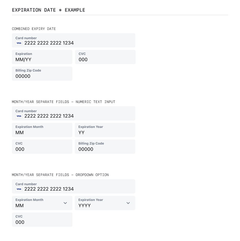
expiryType: "separated-dropdown", // "separated-dropdown", "separated-text", "combined"
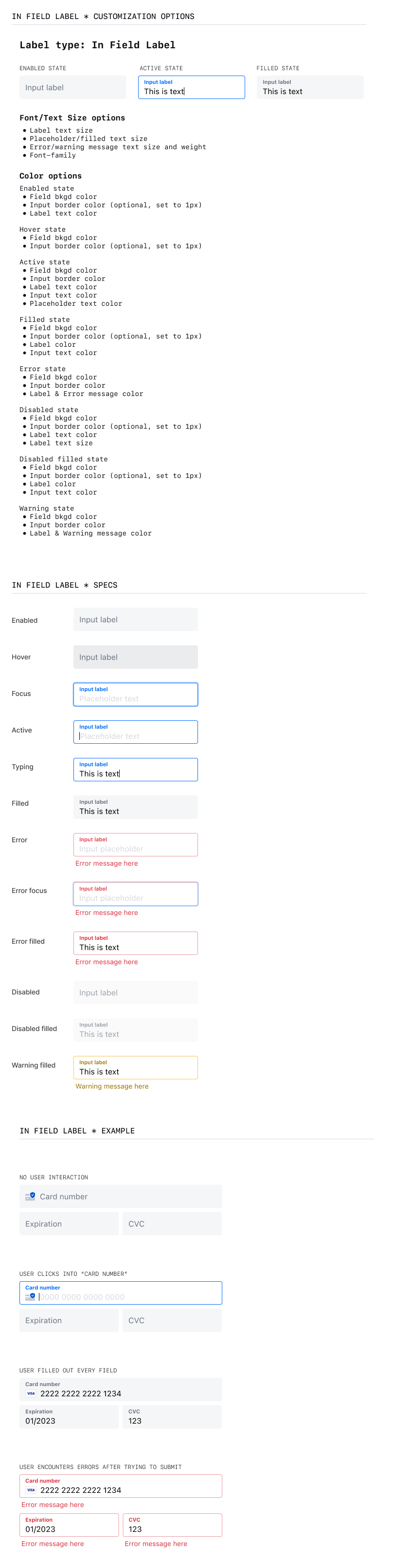
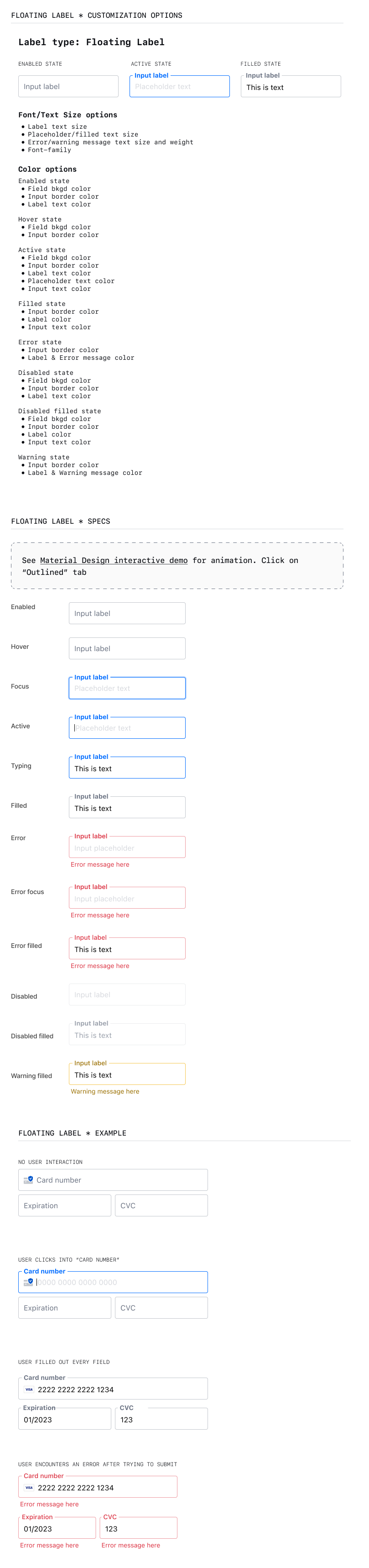
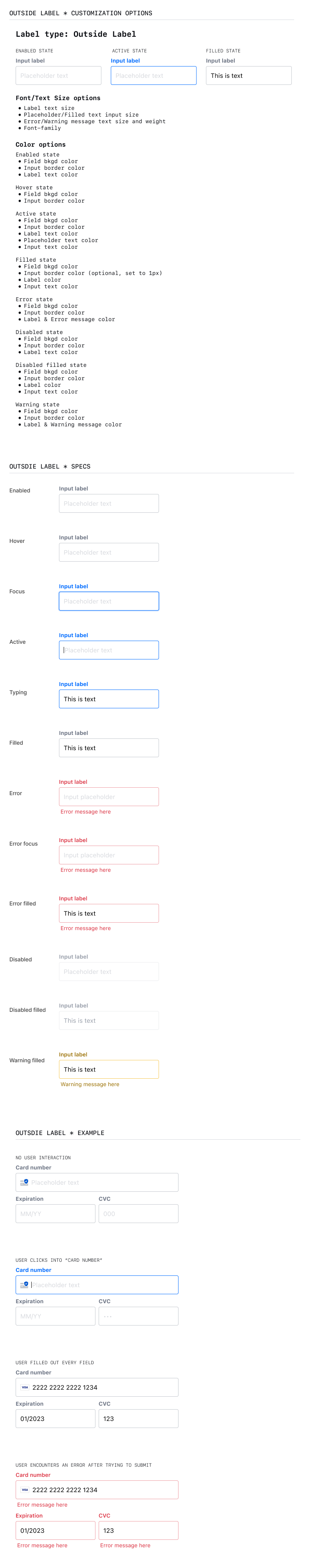
labelStyle: "floating", // "floating", "in-field", "outside-field"
showBillingZIPField: false, // true, false
cardIconAlignment: "right" // "left", "right"
});
field.on("focus", () => {
console.log("focused");
});
field.on("blur", () => {
console.log("blurred");
});
field.mount("#credit-card-input-target"); // change #credit-card-input-target to match the id of your store's frontend input field
</script>
`bolt.create` Arguments
`style` Properties
Examples
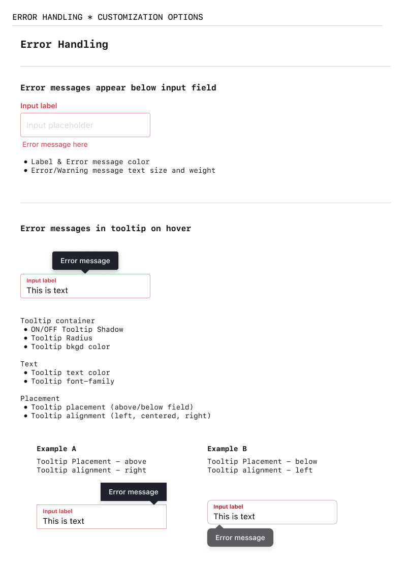
The following assets show how and where checkout field properties appear, based on the type of field.