This guide will help you style the Payment Fields components for the Bolt Accounts product.
Bolt’s on-page components use a psuedoclass styling methodology to apply styling at the element-level. This will assist in more consistent styling across components and give more granular control to styles as shoppers interact with your components.
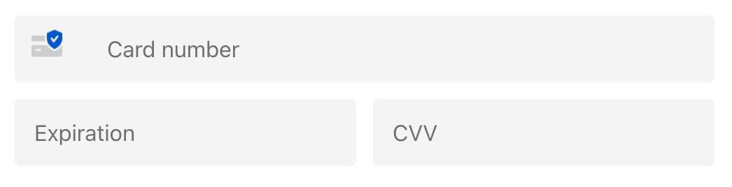
Default Styling
To access our default Bolt theme, you do not need to apply any styles to the component code or scripts.
How Bolt Component Styling Works
Explanation of the structure
--bolt-<target>_<variant>_<sentiment>_<intent>_<transientState>-<subtarget>-<property>
| Token Piece | Required | Definition | Examples |
|---|---|---|---|
--bolt |
Yes | Targets Bolt component. | N/A |
-target |
Yes | Applies styles to named element. | -input, -button, content |
_variant |
No | Allows the targeting of elements with multiple variations, such as buttons. | For buttons: _primary, _secondary, _tertiary. |
_sentiment |
No | Similar to variant, allows the targeting of elements with multiple variations of mood, such as warning messages. |
_neutral, _warning, _critical, _informative |
_intent |
No | Allows the targeting of an element based on its current display state. | For checkboxes: _checked or _unchecked For menu items: _selected or null For input fields: _empty or _filled |
_transientState |
No | Allows the application of styling basd on the end-user’s interaction with the element. | _enabled, _hover, _pressed, _active, _focus, _focus-visible, _disabled |
-subtarget |
No | Applies styles to the named child element of the named -target. |
For input fields: -label, -placeholder, and -helpText |
-property |
Yes | Specifies the CSS property where the styling will apply. | Any CSS property, formatted in camelCase, such as: -backgroundColor or -fontFamily |
Implementation
You may implement styling in the way that best suits your use case.
This option will, in the future, allow you to carry styles to other on-page components as they become available.
Bolt.configureOnPageStyles({
    version: 3,
    "--bolt-input-fontFamily": "Sans Serif",
    "--bolt-input-fontSize": "14px",
});
This option allows you to initialize the Payment Fields Component and specify its styles on creation.
const paymentComponent = Bolt.create("payment_component", {
    styles: {
        version: 3,
        "--bolt-input-fontFamily": "Sans Serif",
        "--bolt-input-fontSize": "14px"
    }
});
This option allows you to mount styling after you have already initialized the component.
paymentComponent.setStyles({
    version: 3,
    "--bolt-input-fontFamily": "Sans Serif",
    "--bolt-input-fontSize": "14px"
});
Sample Constructions
--bolt-input_neutral-backgroundColor
// Target: Input Field
// Sentiment: Neutral
// Property: Background color

--bolt-input_critical-backgroundColor
// Target: Input Field
// Sentiment: Critical
// Property: Background color

--bolt-input_critical-label-color
// Target: Input Field
// Sentiment: Critical
// Subtarget: Label on Input Field
// Property: (Text) color
Token Priority Logic
Tokens are ranked according to their specificity in targeting an element or variation of an element.
For example, --bolt-input_empty_enabled-color will override --bolt-input_empty-color because it more clearly defines where the override is needed.
Additional Rules
These rules are meant to save you some time testing styling issues you may encounter, as Bolt’s component design includes some nuance that impact your token construction.
-
The properties
fontFamily,padding,borderWidth, andborderRadiusare only defined forinputand not for their child elements (named in our token assubtarget). Therefore, only simple tokens for these properties, such as--bolt-input-borderRadiusare valid. A construction such as--bolt-input_filled-borderRadiuswould be redundant and therefore not allowed. -
The
transientStateofplaceholderonly definescolorand can only be defined once. For example,--bolt-input-placeholder-coloris allowed, while--bolt-input_filled-placeholder-fontFamilyis not allowed. The placeholder’s fontFamily can be defined by a constuction such as--bolt-input-fontFamily. -
The
transientStateofhoveronly changes withborderColororbackgroundColor. Whether it is borderColor or backgroundColor depends on thesentiment. For example,--bolt-input_neutral_hover-borderColorand--bolt-input_neutral-borderColorare allowed, while--bolt-input_filled_hover-borderColoris not allowed. -
The
subtargetoflabeldoes not change withintent. For example--bolt-input_filled-label-coloris not allowed. -
The
subtargetofhelpTextcan only have itscolorchanged bysentiment(as opposed tointentortransientState). Additionally,fontSizeandmarginonly declared once forhelpText. For example,--bolt-input_neutral-helpText-color,--bolt-input-helpText-fontSize, and--bolt-input-helpText-marginare allowed, while--bolt-input_hover-helpText-coloris not. -
For
warningandcriticalsentiments,focuswill not change styling. Onlyneutralandfilledstates will change onfocus. However,disabledcan targetinputandlabel(thesubtarget). For example,--bolt-input_disabled-borderColorand--bolt-input_disabled-label-colorare allowed, while--bolt-input_warning_disabled-borderColorand--bolt-input_warning_disabled-colorare not.
Common Design Tokens
Use Case: Underlined Input Fields
To create underlined input fields, we recommend constructing and modifying the following tokens:
Bolt.configureOnPageStyles({
    version: 3,
    "--bolt-input-borderRadius": "0px",
    "--bolt-input-borderWidth": "0 0 1px"
    });
Collection of Input Variations
The possibilities are endless - you can completely customize just about any piece of an on-page Bolt component.
Basic Input Styling
--bolt-input-fontSize
--bolt-input-fontFamily

--bolt-input-padding

--bolt-input-borderRadius
--bolt-input-borderWidth

--bolt-input-placeholder-color

--bolt-input-helpText-fontSize
--bolt-input-helpText-margin

--bolt-input-borderColor
--bolt-input-backgroundColor
--bolt-input-color
Input Status Variations
// ENABLED INPUT FIELD STYLING
--bolt-input_enabled-borderColor
--bolt-input_enabled-backgroundColor
--bolt-input_enabled-color

// FOCUSED INPUT FIELD STYLING
--bolt-input_focus-borderColor
--bolt-input_focus-backgroundColor
--bolt-input_focus-color

// EMPTY INPUT FIELD STYLING
--bolt-input_empty-borderColor
--bolt-input_empty-backgroundColor
--bolt-input_empty-color
--bolt-input_empty_enabled-borderColor
--bolt-input_empty_enabled-backgroundColor
--bolt-input_empty_enabled-color
--bolt-input_empty_focus-borderColor
--bolt-input_empty_focus-backgroundColor
--bolt-input_empty_focus-color

// FILLED INPUT FIELD STYLING
--bolt-input_filled-borderColor
--bolt-input_filled-backgroundColor
--bolt-input_filled-color
--bolt-input_filled_enabled-borderColor
--bolt-input_filled_enabled-backgroundColor
--bolt-input_filled_enabled-color
--bolt-input_filled_focus-borderColor
--bolt-input_filled_focus-backgroundColor
--bolt-input_filled_focus-color

// NEUTRAL INPUT FIELD STYLING
--bolt-input_neutral-borderColor
--bolt-input_neutral-backgroundColor
--bolt-input_neutral-color
--bolt-input_neutral_enabled-borderColor
--bolt-input_neutral_enabled-backgroundColor
--bolt-input_neutral_enabled-color
--bolt-input_neutral_focus-borderColor
--bolt-input_neutral_focus-backgroundColor
--bolt-input_neutral_focus-color
--bolt-input_neutral_empty-borderColor
--bolt-input_neutral_empty-backgroundColor
--bolt-input_neutral_empty-color
--bolt-input_neutral_empty_enabled-borderColor
--bolt-input_neutral_empty_enabled-backgroundColor
--bolt-input_neutral_empty_enabled-color
--bolt-input_neutral_empty_focus-borderColor
--bolt-input_neutral_empty_focus-backgroundColor
--bolt-input_neutral_empty_focus-color
--bolt-input_neutral_filled-borderColor
--bolt-input_neutral_filled-backgroundColor
--bolt-input_neutral_filled-color
--bolt-input_neutral_filled_enabled-borderColor
--bolt-input_neutral_filled_enabled-backgroundColor
--bolt-input_neutral_filled_enabled-color
--bolt-input_neutral_filled_focus-borderColor
--bolt-input_neutral_filled_focus-backgroundColor
--bolt-input_neutral_filled_focus-color

// CRITICAL INPUT FIELD STYLING
--bolt-input_critical-borderColor
--bolt-input_critical-backgroundColor
--bolt-input_critical-color
--bolt-input_critical_enabled-borderColor
--bolt-input_critical_enabled-backgroundColor
--bolt-input_critical_enabled-color
--bolt-input_critical_empty-borderColor
--bolt-input_critical_empty-backgroundColor
--bolt-input_critical_empty-color
--bolt-input_critical_empty_enabled-borderColor
--bolt-input_critical_empty_enabled-backgroundColor
--bolt-input_critical_empty_enabled-color
--bolt-input_critical_filled-borderColor
--bolt-input_critical_filled-backgroundColor
--bolt-input_critical_filled-color
--bolt-input_critical_filled_enabled-borderColor
--bolt-input_critical_filled_enabled-backgroundColor
--bolt-input_critical_filled_enabled-color

// WARNING INPUT FIELD STYLING
--bolt-input_warning-borderColor
--bolt-input_warning-backgroundColor
--bolt-input_warning-color
--bolt-input_warning_enabled-borderColor
--bolt-input_warning_enabled-backgroundColor
--bolt-input_warning_enabled-color
--bolt-input_warning_empty-borderColor
--bolt-input_warning_empty-backgroundColor
--bolt-input_warning_empty-color
--bolt-input_warning_empty_enabled-borderColor
--bolt-input_warning_empty_enabled-backgroundColor
--bolt-input_warning_empty_enabled-color
--bolt-input_warning_filled-borderColor
--bolt-input_warning_filled-backgroundColor
--bolt-input_warning_filled-color
--bolt-input_warning_filled_enabled-borderColor
--bolt-input_warning_filled_enabled-backgroundColor
--bolt-input_warning_filled_enabled-color
Hover on Input Styling
--bolt-input_hover-borderColor
--bolt-input_hover-backgroundColor

--bolt-input_neutral_hover-borderColor
--bolt-input_neutral_hover-backgroundColor

--bolt-input_critical_hover-borderColor
--bolt-input_critical_hover-backgroundColor

--bolt-input_warning_hover-borderColor
--bolt-input_warning_hover-backgroundColor
Input Label Styling
--bolt-input-label-color
--bolt-input_enabled-label-color
--bolt-input_focus-label-color
--bolt-input_neutral-label-color
--bolt-input_neutral_enabled-label-color
--bolt-input_neutral_focus-label-color

--bolt-input_critical-label-color
--bolt-input_critical_enabled-label-color
--bolt-input_critical_focus-label-color

--bolt-input_warning-label-color
--bolt-input_warning_enabled-label-color
--bolt-input_warning_focus-label-color

--bolt-input-label-margin
--bolt-input-label-fontWeight
--bolt-input-label-fontSize

--bolt-input_enabled-label-margin
--bolt-input_enabled-label-fontWeight
--bolt-input_enabled-label-fontSize
--bolt-input_focus-label-margin
--bolt-input_focus-label-fontWeight
--bolt-input_focus-label-fontSize
--bolt-input-helpText-color
--bolt-input_neutral-helpText-color
--bolt-input_critical-helpText-color
--bolt-input_warning-helpText-color
--bolt-input_disabled-borderColor
--bolt-input_disabled-backgroundColor
--bolt-input_disabled-color
--bolt-input_disabled-label-color