📍
Bolt Help / Developer Resources / References / Modal Styling
Learn about the styling options available for the Bolt Checkout modal.
As a Merchant partnered with Bolt, you can customize your checkout experience in a variety of ways. This allows you to keep your experience on-brand as well as achieve more control over engagement with your shoppers.
NOTE
Contact your Customer Success Manager (CSM) to request customizations.
Styling Options
Buttons
TIP
Refer to our button styling guide when customizing your checkout experience.
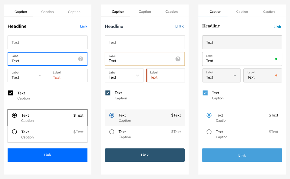
Radio Buttons
You can update the following for radio buttons:
- Border Radius: The border radius for the container around the radio button and associated text (e.g. 3px).
- Unselected/Hover Button Color
(RGBA): The color of the radio button when unselected (including on when a customer hovers over it). - Unselected Background Color
(RGBA): The color of the container around the radio button and the associated text when unselected. - Unselected Border Color
(RGBA): Border color of the container around the radio button and associated text when unselected. - Selected Button Color
(RGBA): The color of the radio button when selected. - Selected Background Color
(RGBA): The color of the container around the radio button and the associated text when selected. - Selected Border Color
(RGBA): Border color of the container around the radio button and associated text when selected. - Hover Background Color
(RGBA): The color of the container around the radio button and the associated text when hovered. - Hover Border Color
(RGBA): Border color of the container around the radio button and associated text when a customer hovers over it.
Fields
You can update the color, shape, and style for field elements in the checkout experience.
- Border Radius: The border corner radius for fields (e.g. 3px).
- Focused Field: The currently selected field.
- Focused Border Color
(RGBA): Border color when the field is focused. - Focused Label Color
(RGBA): Label text color for a focused field. - Focused Background Color
(RBGA): The background color for a field when it is focused. - Unfocused Field: All unselected fields.
- Unfocused Border Color
(RGBA): Border color when the field is unfocused/unselected. - Unfocused Background Color
(RBGA): The background color for a field when it is unfocused/unselected.
Field Copy
| Field | Current Text (Character Limit) |
|---|---|
| Order notes | The placeholder text (60) and label (30) for the optional order notes field. This field can be activated via Checkout Settings. |
| Promo link | Discount (20) This field can be activated via Checkout Settings. |
| Field labels | Shipping details: Email (20) Phone (20) First name (20) Last name (20) Company name (40) Shipping address (40) Apartment, building, floor (optional) (30) Payment details: Card number (40) Expiration (20) CVV (20) First Name (20) Last Name (20) |
| Line 2 link | Apartment, building, floor (30) |
| Shipping step button | Continue (30) |
| Delivery step button | Continue (30) |
| CVV helper text | The CVV/Security Code is the 3-digit code on the back of your card (60) |
| Tab names | Shipping, Delivery, Payment (12) |
| Mini-cart sections | Subtotal, Total, Shipping, Tax (10) |
Customizable Fields
You can add the following custom field types to the Bolt Checkout modal:
Modals
You can update the following for Bolt Checkout modals:
- Border Radius: The border corner radius for the container modal (e.g. 3px).
- Modal Color
(RGBA): The background color of the modal itself (currently white). - Font Family: Selected from a preset list of font options that won’t affect load times.
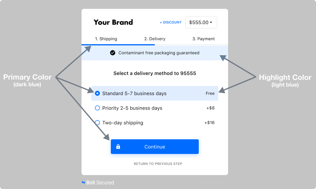
Theme Colors
You can customize the primary and highlight colors in the Bolt Checkout.
| Primary Color | Highlight Color |
|---|---|
| Standard Buttons | Selected Radio (Background) |
| Radio Buttons & Checkboxes | Banner (Background) |
| Mini Cart | |
| Focused Field Border | |
| Labels | |
| Links |